19 Web Design Tips & Tricks to Enhance User Experience

We’ll agree that first impressions matter in everything!
Including your website.
As 94% of first impressions are design-related, your website’s design is a potent tool for attracting and retaining users, making knowledge of effective web design strategies crucial.
Embracing a thoughtful approach to typography, colors, and imagery ensures consistency while incorporating responsive layouts and strategic calls to action to enhance user experience.
In this guide, I’ll reveal the best tips for designing a great website that improves user experience and enhances conversions.
Lets get to it!
1. Map Your Framework/Raw Design First

Before diving into the details, it’s crucial to map out your website’s framework or raw design. Think of it as drawing the blueprints for a building; it’s not just about the walls and roof but how every space interacts and flows together.
Your framework is the skeleton upon which you’ll flesh out the intricate parts of your site.
Begin by determining the essential components:
- Header
- Footer
- Navigation
- Content areas
You can draw a rough sketch or pattern of your website’s appearance using mind-mapping software like Miro, Creately, Xmind, MindMup, or MindMeister.
A well-mapped framework ensures a cohesive, user-friendly interface. It allows you to lay a solid foundation for a responsive, accessible, and scalable website. By structuring your layout early on, you avoid significant redesigns or functionality issues later, saving time and resources.
2. Maintain A Simple And Uncluttered Homepage
Your homepage serves as the front door to your website; it’s the first impression you make on a visitor. Keeping your homepage simple and uncluttered gives your users a clear path to the information they seek without being overwhelmed.
A cluttered homepage overwhelms visitors and makes finding what they want challenging. Keeping it simple enhances the user experience, making it easier for visitors to navigate your site and swiftly access the necessary information.
A clean homepage lets you convey your message clearly and effectively.
For example, take a look at FreshBooks’ homepage design:

When there’s too much going on, your message can get lost in the noise.
Freshworks has done great work on this by focusing on the essentials, ensuring that their core message: “Accounting Software Built for Business Owners and Accountants” is front and center and above the fold of their homepage – making it more likely to resonate with visitors.
That’s not all.
Another thing you would notice while scrolling the Freshworks homepage is its simplicity.
You’ll notice that unnecessary clutter is absent, allowing key elements, buttons, texts, Call-to-actions etc to stand out effectively.
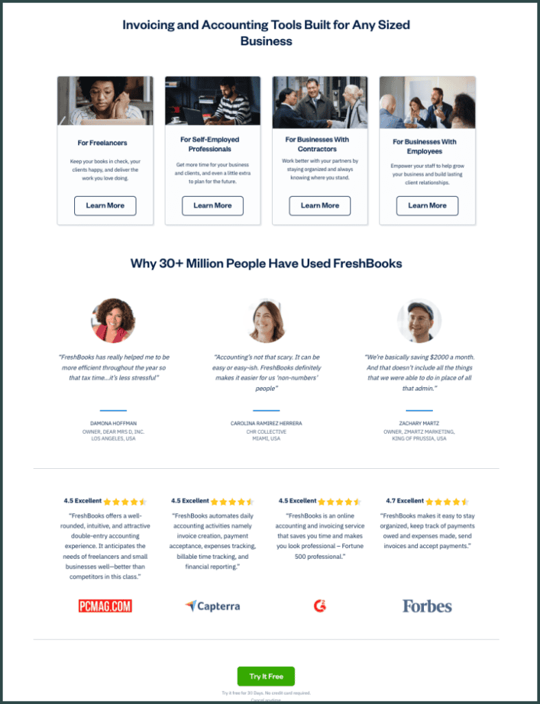
Their clean design, minimalistic layout, and strategic white space create a visually appealing experience that draws visitors in.
3. Use Responsive Design To Ensure Compatibility Across Devices
By implementing responsive design, you ensure that your site will accommodate your audience’s screen size and resolution, whether using a smartphone, tablet, laptop, or desktop. Endeavor to cater to your audience’s preferences by ensuring a consistent and intuitive experience, regardless of the device.
Like water takes the shape of its container; responsive design enables your website’s layout to change fluidly based on the user’s screen.
360×640 pixels screen resolution is common among mobile users with a significant market share, but it’s just part of the picture. Your design should address a spectrum of resolutions, including those of average laptops and large desktops.
4. Incorporate Enough White Space For A Clean Layout
When designing your website, ensure that you allocate ample white or negative space around various elements on the page. White space refers to the web page’s parts left unmarked by text, images, or other content.
By integrating sufficient white space in your design, you establish a clean layout that emphasizes the importance of elements within that space.
Think of white space as the canvas’ breath; it’s where your content can breathe freely, making your site’s features stand out more distinctly.
It can significantly enhance readability by preventing content overload. When text and images are surrounded by ample white space, it becomes easier for users to navigate and consume information, as it appears less crowded and overwhelming.
Lets take Uber’s landing page, for instance, it a very clean layout, an uncluttered homepage, and has a clear CTA, which even makes it stand out for its simplicity.
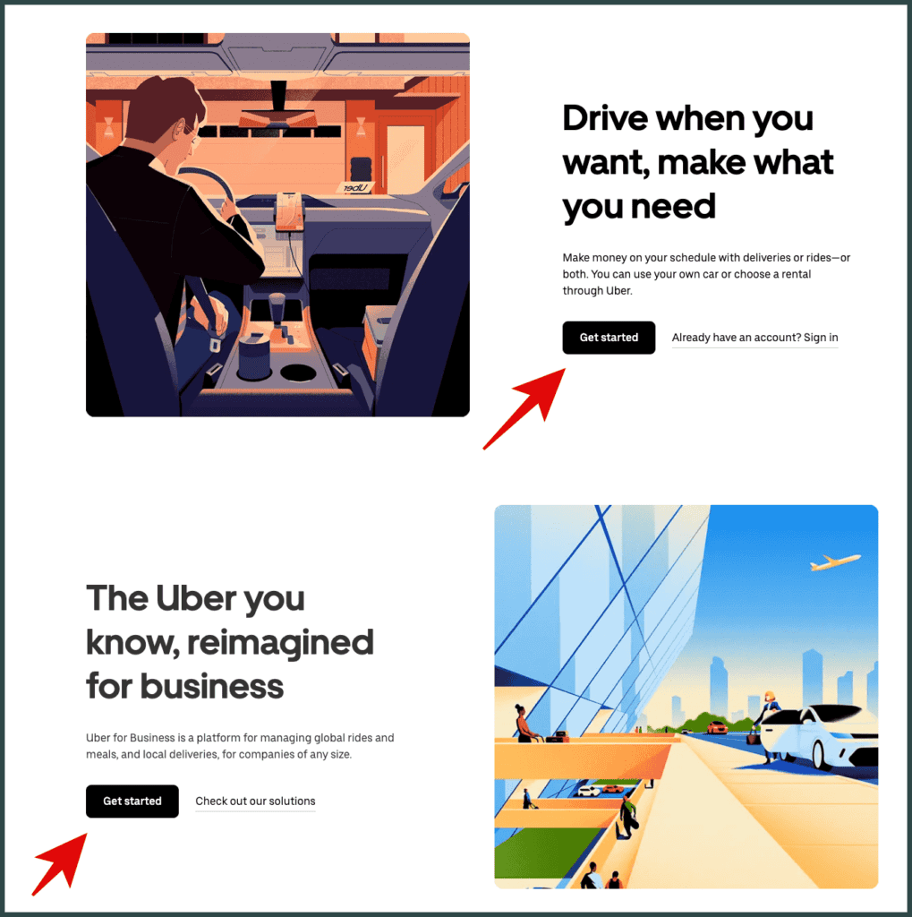
The strategic use of white space allows the key elements to breathe, guiding the visitor’s focus and making navigation intuitive. Uber’s landing page exemplifies how a minimalist approach can enhance user experience, driving attention toward the Call to Action (CTA) without distractions.
5. Implement An Intuitive And Clear Navigation
A clear website navigation guides users through your website, much like a map assists travelers in a new city. You aim to make their journey through your site as smooth and efficient as possible.
Remember, your website’s navigation is the backbone of usability. It should follow a logical hierarchy, ensuring visitors can find exactly what they want with minimal clicks.
Consistency is key—keep your navigation structure predictable across all pages.
Here’s how I’d go about creating a better navigation:
- Menu Labels: Use descriptive, concise labels immediately clear to the user.
- Search Function: Integrate a search bar to help users quickly locate specific content.
- Breadcrumb Trails: Display a clear path of the pages a user has visited, providing context and an easy route back.
6. Prioritize User-friendly Typography For Readability
Like the lanes and signs on the road, typography guides visitors through your site. Readability is not just about aesthetics; it’s about making your content accessible and easily comprehended.
Here’s how I’d go about it:
- Size Matters: Aim for a font size between 15 and 25 pixels for optimal legibility. Fonts smaller than this can be difficult to read on various devices.
- Font Style: Use styles that enhance clarity. Avoid overly decorative fonts that could distract from the message.
Keep the number of typefaces to a minimum. Introducing too many fonts can create a chaotic reading environment. As a rule of thumb, use two or three complementary fonts. Another tip is to ensure sufficient contrast between your text and background. Dark text on a light background or vice versa will make the content more readable.
7. Implement An SEO Plan To Improve Search Engine Rankings
Do not neglect SEO when designing your website. It’s the key to unlocking visibility and attracting organic traffic. Neglecting SEO means potentially losing out on valuable opportunities for your website to be discovered by users actively searching for your content or products.
Here are a few important factors to consider for SEO when designing your site:
- Responsive Design: Ensure the website works well on all devices.
- Clear Site Structure: Organize content logically for easy navigation.
- Fast Loading Times: Optimize images and code for speed.
- Image Optimization: Use descriptive filenames and alt tags for images.
- Semantic HTML: Use proper HTML tags to structure content.
- Meta Tags: Include relevant meta titles and descriptions.
- Structured Data Markup: Implement structured data for search engines.
- CSS and JavaScript Optimization: Minimize and optimize code.
- Canonicalization: Prevent duplicate content issues.
- Cross-Browser Compatibility: Ensure compatibility across browsers and devices.
By implementing a robust SEO plan, you ensure your website is optimized for search engines, making it easier for your target audience to find you amidst the vast online landscape.
8. Use High-quality Images And Graphics
In web design, your choice of images and graphics can undoubtedly make or break your site’s visual impact.
High-quality images are like the wardrobe of your web presence; they should be chosen carefully to ensure they fit well with your brand’s style and message. They are essential not just for aesthetics but also for engagement and conversion.
Before you upload and publish an image, invest time in editing and compressing your images to avoid slow loading times, which can deter visitors. Proper lighting, color correction, and cropping can enhance the visual message.
9. Optimize Images For Fast Loading Times
The average page speed of a website is 3.21 seconds. Visitors are likely to bounce back when your website loads slowly. As page load time goes from 1 second to 3 seconds, the probability of bounce increases by 32%. People can be impatient.
Think of a heavy suitcase at the airport. As you remove unnecessary items to avoid extra fees, strip away excessive image data to improve your site’s load time.
Optimizing your website’s images is crucial for improving page load times and overall user experience. Images account for a significant portion of a page’s load time, so efficient image optimization can dramatically speed up your site.
Here’s how to optimize for faster loading site:
- Compress Images: Tools like TinyPNG or Smush can reduce file size without compromising quality.
- Choose the Right Format:
- JPEG for photographs.
- PNG for graphics with transparency.
- WebP for a balance of quality and compression.
- Consider Resolution: High-resolution images are larger in size. Resize them to the maximum resolution needed on your site.
- Leverage Browser Caching: Store images in your visitors’ browser cache to reduce loading times on subsequent visits.
10. Ensure Accessibility For All Users, Including Those With Disabilities
Accessibility isn’t a feature; it’s a social imperative. The internet is an integral part of daily life, and ensuring everyone can access your website is a matter of legal compliance and inclusive design.
For example, 1 in 4 U.S. adults live with a disability, according to the Centers for Disease Control and Prevention.
When designing your website, it must be accessible to all users, including those with disabilities. This means your website should be navigable and usable for people with various impairments, whether visual, auditory, physical, or cognitive.
Here are a few tips to consider:
- Alt Text for Images: Always include alternative text for images. This simple step allows users who can’t see images to understand what they represent.
- Keyboard Navigation: Ensure that your site is fully navigable by keyboard. This assists users with mobility impairments who cannot use a mouse.
- Contrasting Colors: Use high-contrast color schemes to help users with color vision deficiency or low vision. For text, aim for a luminance contrast ratio of at least 4.5:1.
11. Choose A Cohesive Color Scheme To Enhance Visual Appeal

When designing your website, selecting a cohesive color scheme is like picking the perfect outfit for an interview—it must be well-coordinated and make a positive impression.
A consistent color palette does more than please the eye; it conveys your brand’s identity and values. An effective color scheme fosters a sense of harmony and balance throughout your website.
Begin by choosing a dominant color that reflects your brand. This color will serve as your design’s anchor, providing a base to select complementary colors. Consider the psychology of color; for example, blue often elicits a sense of trust, making it a popular choice for finance websites.
Now, let’s talk about the different roles colors play:
First off, you’ve got your Dominant color. This is the big player, the main hue that represents your brand’s identity.
Then there are your Secondary colors – think of them as the supporting cast. These are 2-3 other shades that complement your dominant color beautifully.
And last but not least, Accent colors. These little pops of color add some flair to your calls to action and important buttons.
12. Showcase Customer Testimonials To Build Trust
When planning your website, it’s essential to highlight customer testimonials as they can seal your clientele’s approval. By displaying positive feedback, you reassure visitors of your credibility and foster a sense of trust in your offerings.
Here’s why it’s a significant move:
- Social Proof: Like a personal recommendation, testimonials act as social proof, where prospective customers see others’ positive experiences and feel more comfortable purchasing.
Here’s how you can effectively use testimonials:
Select Diverse Testimonials: Aim for a mix that reflects a variety of customers, industries, and scenarios. This approach resonates with a broader audience and demonstrates your versatility.
Incorporate Different Formats:
- Written Quotes: Short and direct endorsements from clients.
- Video Testimonials: More engaging and can convey emotion more effectively.
Here’s an example of an endorsement/testimonial ClickFunnels uses on its homepage:

As you can see, these are trusted and credible influencers in the business world. Each testimonial here portrays a satisfied customer who has benefited from using ClickFunnels in their business.
Whether you’re showcasing improved efficiency, cost reductions, or user satisfaction, ensure the testimonials directly relate to the key benefits of your product or service.
13. Simplify Forms To Reduce Friction
When designing web forms, your goal should be to minimize user effort and maximize clarity.
Complex forms can increase the time users take to fill them out, leading to frustration and potential abandonment. Use a single-column layout to ask for only essential information, helping streamline the flow and prevent users from missing fields.
By simplifying web forms, you reduce friction and likely increase the odds of form completion.
Here’s why simplifying forms matters:
- Short Loading Times: Complex forms often take longer to load. Users expect immediate access; they may leave if it’s not provided.
- Enhanced User Experience: A simple form feels effortless, encouraging users to complete it without feeling overwhelmed.
- Higher Conversion Rates: The easier a form is to complete, the more likely users are to finish and submit it, thus boosting conversions.
14. Have A Specific Goal For Every Page
According to research, landing pages with a single call-to-action can increase conversions by over 200%. This highlights the power of focus.
When designing a website, it’s crucial to establish a unique purpose for each page. This strategic focus ensures your content is streamlined and your message clear. Visitors should immediately understand the page’s objective—whether to inform, entertain, or prompt an action like a purchase or sign-up.
Specific goals keep users engaged. A page with too many actions can overwhelm visitors, making them less likely to take any action.
Take GetResponse as an example—they seamlessly integrate all their features into the main menu, each leading to dedicated pages highlighting the unique benefits of each feature.
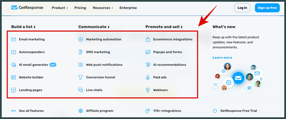
Every feature page is targeted to sell just that feature.
For instance, their ‘AI Email Generator’ feature page is meticulously crafted to demonstrate the exceptional capabilities of their AI-driven email generation tool.
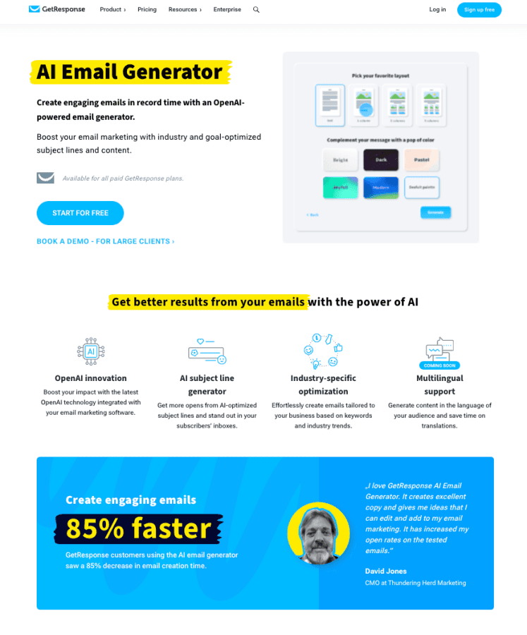
Just a specific goal.
This is the same strategy employed for other of their tools and email marketing features. You’ll notice that this is the pattern for most product and service websites on the internet – every page functions like a dedicated salesperson.
15. Optimize The Website Footer
Your website footer isn’t just the end of the page—it’s a powerful tool for engagement and navigation. Think of it like the foundation of a building: although at the bottom, it’s critical for stability and structure.
To ensure your footer enhances your users’ experience:
- Include Essential Links: Like signposts, direct traffic to key areas of your site such as your ‘About Us’, ‘Contact’, or ‘FAQ’ page.
- Incorporate a Sitemap: This isn’t just for user navigation—search engines love sitemaps too, which can help boost your SEO.
- Consistency is Key: Keep your branding uniform with your site’s overall design. Use an inverted color scheme to maintain readability and highlight the footer area.
- Leverage Social Media: Just as a handshake expands your network, adding social media icons can extend your brand’s reach.
Your footer is also an ideal location for capturing potential leads. Including an email sign-up form turns a passive visitor into an active opportunity.
16. Create A Custom 404 Error Page
When you manage a website, some visitors will undoubtedly stumble upon a 404 error page.
This occurs when a page they’re trying to access is unavailable or never existed. Turning this potential frustration into a positive experience can keep users engaged rather than driving them away. Here’s a great post by SearchEngineJournal about 404 pages with some inspirational examples.
17. Install/Connect A Heatmap Tool To Gather Visitors Data
Imagine your website as a physical store. A heatmap is like a security camera showing you which shelves your customers browse the most, where they walk past quickly, and which products they pick up or ignore.
As you refine your website’s design, it’s crucial to understand how users interact with your pages. Implementing a heatmap tool can offer insightful data on visitor behavior.
Heatmaps are visual representations that show where users click, move, and scroll on your site.
Here’s why heatmaps matter:
- Identify Usability Issues: You can pinpoint areas where visitors are getting stuck or are confused.
- Optimize Conversion Rate: By analyzing the most engaged parts of your site, you can place important call-to-action buttons in these hot zones.
- Improve Content Layout: Understand which parts of your pages receive the least attention, helping you to rearrange or rework content effectively.
18. Connect Google Analytics To Track Visits
To effectively understand your website’s performance, you need data on who visits and how they interact with it. Google Analytics is a pivotal tool that you can integrate into your web design to track this information.
When you install Google Analytics, you gain access to a wealth of data, including visitor demographics, behavior, and acquisition channels. This information is crucial for optimizing your site’s design and content to enhance user experience and conversion rates.
19. Place A Search Bar At The Top Of Your Pages
When designing your website, it’s crucial to consider the placement of your search bar.
Positioning it at the top of your pages can significantly enhance user experience. Users often expect to find search functionality in the top-right or top-center of a webpage, akin to how one naturally looks at the top of a map for the compass.
My Final Thoughts – Keep Learning & Stay Updated
In my experience, the world of web design is perpetually evolving.
I’ve been in the website development world for over half a decade, and things aren’t the same as they used to be.
You’ll find that trends come and go, and technologies advance rapidly. To stay relevant and competitive, you must commit to ongoing learning and stay abreast of new developments.
- Explore Online Resources: You can access countless tutorials, webinars, and online courses. Use platforms like YouTube, Coursera, and Udemy to keep your skills sharp.
- Join Communities: Engage with other web designers in communities such as Stack Overflow, Reddit’s web design forums, web design Facebook groups, and LinkedIn groups. These can be invaluable for staying informed about the latest trends and getting feedback on your work.
- Subscribe to Newsletters/Blogs: Industry leaders and companies often share insights through newsletters, blogs, and Twitter. Subscribe to these for regular updates directly to your inbox.
The key is to be proactive in your education. Don’t just wait for new trends to become mainstream; by then, you’re already behind. Instead, test out new tools and experiment with new design practices whenever you can.
Frequently Asked Questions
How should a beginner approach web design for the first project?
When starting your first web design project, focus on learning the basic design principles such as layout, color theory, and typography. Begin with a simple, clean design and gradually incorporate more complex features as your confidence grows.
What are the essential steps to achieve effective web design?
To achieve effective web design, you should first define your goals and target audience. Then, prioritize intuitive navigation, consistent typography, responsive layout, and engaging content.
What layout strategies contribute to a user-friendly website design?
Employ a grid-based layout to organize content for a clean, structured appearance. Ensure your design is responsive and adapts smoothly to different screen sizes. Use clear visual hierarchies with strategic placement of calls to action to guide users effortlessly through your site.
What design recommendations for small businesses looking to create an online presence are you?
Small businesses should focus on creating a professional, branded online presence with a clear message. They should optimize for mobile users, leverage high-quality imagery that relates to their brand, and make contact information readily accessible.
How can website navigation be optimized to improve user experience?
Streamline your website navigation by limiting the number of menu items and ensuring they are descriptive. Incorporate a search function to help users find information quickly. Keep the navigation layout consistent across all pages, and use breadcrumbs on larger sites to help users track their location.
Disclosure: We may earn commissions if you buy via links on our website. Commissions don’t affect our opinions or evaluations. We’re also an independent affiliate of many platforms, including ClickFunnels, Kartra, GoHighLevel, Podia, Northwest Registered Agent, and others. We’re not employees of these services. We receive referral payments from them, and the opinions expressed here are our own and are not official statements of these companies.